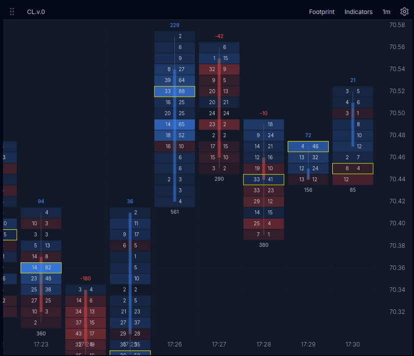
Footprint Chart
The footprint chart breaks each candle into price levels so you can see exactly where buyers and sellers were active. Use it when candlesticks are too aggregated and the DOM is too granular.
Chart Overview
This screenshot shows the footprint layout before you interact with the replay below.
What This Chart Helps With
- See where aggressive buying or selling traded within a bar.
- Spot imbalances, absorption, and high-volume price levels.
- Compare delta and total volume without leaving the chart.
- Condense price levels when you want broader structure.
How To Read It
Cell Values
In sell x buy view, each price level shows executed sells on the left and buys on the right. This makes it easier to see where one side was more aggressive inside the candle.
Delta And Total Volume
The value above a candle can show delta, while the value below can show total volume. Together they help separate directional aggression from overall participation.
Highlighted Levels
Brighter cells and outlined levels help draw attention to prices where the most business was done or where imbalance stood out.
Try the Footprint Chart
Explore the display styles, switch the value mode, and condense price rows to see how the same session reads differently.
Want to practice it live? Try the MNQ footprint trading walkthrough.
This demo loads sample ES data only. The instrument selector shows how switching works in the app, but the other instruments in this embed are unavailable.
Settings
- Sell x Buy / Delta x Vol: Switch the values shown at each price level.
- Gradient / Profile / Histogram: Change how each candle is rendered.
- Condense Prices: Group price rows to reduce noise and emphasize structure.
Condense 2x Price combines two price levels into each displayed row. The candle becomes shorter and easier to scan, while larger volume pockets stand out faster than they do with every price level shown.
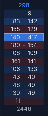
Condense Off
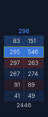
Condense 2x