Orderflow Candlestick Charts
The candlestick view gives an easy to read overview of at what prices has volume traded. Its a good way to see price levels, where volume is, and where large trades have been executed.
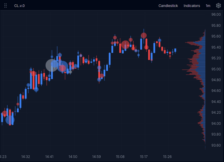
Chart Overview
This screenshot shows the candlestick chart with large trades and volume profile enabled. It gives a quick reference for the layout before you interact with the replay below.
What This Chart Helps With
Use this section for the highest-value outcomes, not a full feature inventory.
- Spot highs, lows, and retracements.
- See where larger participation appears during a move.
- See where volume was accepted or rejected across price levels.
Key Overlays
While a blank candlestick chart is useful for levels, having volume overlays is highly encouraged.
Large Trades
Large trades are drawn as bubbles over the chart to highlight bigger executions during each candle. These are large trades reconstructed into their original size from the tape. The above image shows all trades over a volume of 50. Blue for buys, red for sells, and grey for neutral trades - spread trades. You can try out the overlay below and see individual trade size by pressing each bubble.
Volume Profile
The volume profile on the right shows where volume traded across price levels. We can see the surplus of blue buy volume over sells, eg the positive delta. Typical in an upward trend.
Controls / Settings
- Indicators: Turn overlays like Large Trades and Volume Profile on or off.
- Large Trades minimum size: Raise the threshold to reduce noise and focus on bigger prints.
- Chart scale: In manual mode, drag the price axis to adjust vertical scale.
- Timeframe: Change the candle interval depending on how much structure you want to see.
- Settings: Change height scaling from manual to auto or change visual elements like last price or show trades.
Try the Candlestick Chart
Explore the chart controls and see how orderflow context changes what the candles show.
Open Indicators and enable Large Trades
Raise the minimum size filter
Compare the chart with and without the profile
In manual scale mode, drag the price axis up or down to change the vertical scale
When To Use This Chart
Use the candlestick view when you want the clearest read on overall price structure first, then layer in orderflow context as needed. Switch to footprint when you need volume at each price level, and switch to DOM when you want to study the order book directly.