Heatmap
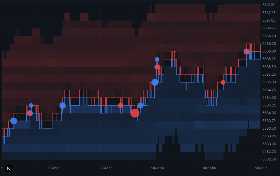
A Depth of Market Chart, is a chart that displays the position of the best bid (blue line) and best offer (red line). Also commonly included are trades represented as circles, blue - buys, red - sells; the larger the circle, the larger the quantity of trade.
Most software providers call these under various names like QuantTower's DOM Heatmap, or Bookmap's DOM Surface. They effectively show the same core information.
This is the default view. The depth strips, the bid and offer lines and the axes are drawn by the chart itself; the trade circles are not - they come from the Big Trades indicator, which the default heatmap script enables with use('Big Trades'). Unticking it in Chart Settings → Indicators leaves the heatmap without dots.
Showing more trades
Big Trades is an ordinary script, so how many circles you see is up to you. By default it hides anything under view.minTradeSize - the instrument's own floor, which is 20 on ES and 1 on most other instruments - and shrinks the dots as you zoom out so they stay separate.
Open Chart Settings → Indicators, edit Big Trades, and replace it with the whole renderer - view.trades is unfiltered, so drawing a circle for each one draws every print:
chart.frame((view, draw) => {
  for (const trade of view.trades) {
    draw.circle({
      time: trade.time,
      price: trade.price,
      radius: Math.min(2 + trade.size / 2, 16),
      color: trade.side === 'sell' ? 'rgba(239, 68, 68, 0.8)' : undefined,
    })
  }
})
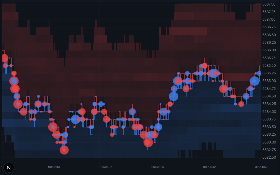
Only time, price and radius have to be there. An omitted color draws the default blue, so only sells need one; borderColor, borderWidth and onPress are left out entirely. Add a continue on trade.size to go the other way and show only the outsized prints. See chart.frame() on the heatmap for the full renderer API.