Create a Big Trades Indicator
In this guide we will go over what a Big Trades indicator is, and how to customize it to fit your trading needs.
What is the Big Trades indicator
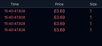
When an order hits the market, it is matched against resting limit orders - this can break apart a large trade making them appear small. Most venues provide ways of reconstructing these trades into their original quantity. These reconstructed trades are available via the reconstructed trades API.
Raw Tape
Reconstructed Tape (Big Trades)
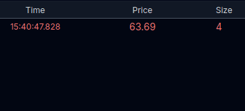
The tape above shows a large (qty 4) trade in its original format, and its reconstructed format.
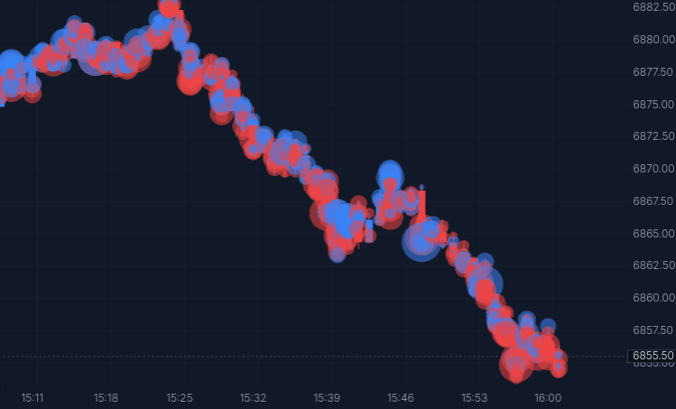
These reconstructed big trades can then be overlaid on a chart as an indicator. The design pattern is pretty basic - the larger the circle, the bigger the trade. However displaying every reconstructed trade can be overwhelming - below is a chart showing us all big trades without any additional filtering.
Customizing the big trades indicator
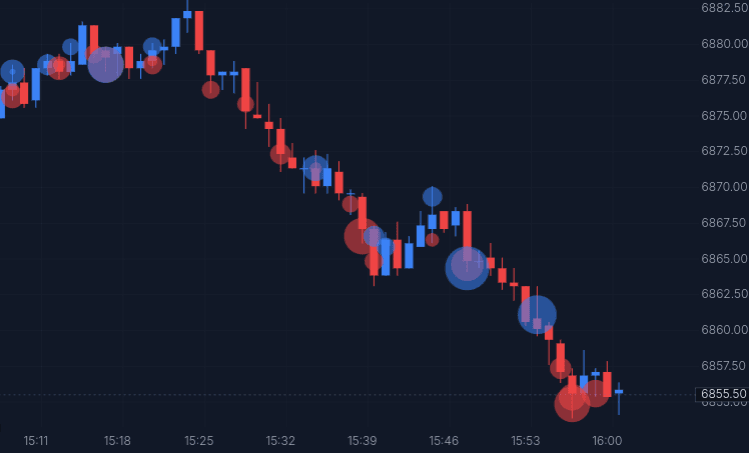
For our example, we want to see the trades of ‘whales’, so let's filter out all smaller trades.
chart.frame((view, draw) => {
  for (const trade of tape.range(view.startTime, view.endTime)) {
    if (trade.size < MIN_SIZE) continue

    const label = trade.side === "buy" ? "Buy" : trade.side === "sell" ? "Sell" : "Trade"
    draw.circle({
      time: trade.timestamp,
      price: trade.levels[0].price,
      radius: radiusFor(trade.size),
      color: trade.side === "buy" ? BUY : trade.side === "sell" ? SELL : FLAT,
      onPress: { text: `${label} ${trade.size}` },
    })
  }
})
The indicator ships in two forms, identical but for one line. Continuous (anchor: "time") puts each circle at the moment it printed, so a burst reads left to right in the order it happened. Indexed (anchor: "candle") puts it on the candle it printed in, so the circles line up with the columns and stack where a candle carried several. On tick intervals the axis has no position finer than a bar, so both draw the same picture.
How to use it
The idea is that large trades are more likely to be smart money. Where are these trades occuring:
- Clusters = repeated participation at a level
- Large trades with no price movement = absorption
- Large trades that move price = initiative
Try Big Trades on a footprint chart. Includes 5 minutes of replay time free daily, shared across up to 3 replays. Upgrade for more.
Further Reading
Large trades that stall at a level often point to Absorption. To see reconstructed trades on a chart, see the Footprint docs, or the Heatmap, where the same indicator draws every trade over the depth.